Brand Strategy
& Cultural
Analysis
Veronica (Sully) studies how internet culture, aesthetics, and identity influence perception and value. Ragcult is her cultural experiment — testing whether styling, narrative, and tone of voice can transform resale fashion into identity artifacts.
Internet aesthetics changed how people construct identity. Ragcult tests what happens when you apply that insight to commerce.
About
Veronica
Veronica (Sully) is a Brand Strategist and Cultural Analyst who studies how internet culture, aesthetics, and identity influence perception and value. She is particularly interested in how resale fashion can function as identity artifacts within aesthetic ecosystems.
Internet aesthetics — cottagecore, dark academia, and other aesthetic communities — changed how people present themselves online. These aesthetics act as permission structures for self-expression. They allow individuals to post themselves publicly without appearing narcissistic because they participate in a shared visual culture rather than simply promoting themselves.
Corporate brands imitate internet subcultures to appear culturally relevant. Audiences perceive the attempt as insincere. This tension between authentic participation and corporate imitation is central to the Ragcult project.
Ragcult tests what happens when cultural insight drives commerce instead of the other way around.
- Internet aesthetic culture
- Identity construction on social media
- Authenticity vs. performance online
- How styling and storytelling influence perceived value
- How brands attempt to imitate internet subcultures
When an item is presented neutrally, it is seen as a product. When the same item is styled within an aesthetic narrative, it becomes part of an identity. Resale clothing functions as modular identity fragments that people use to construct online personas.
What I
Do
Cultural Pattern Recognition
Identifying emerging aesthetic movements, subculture behaviors, and audience signals before they reach mainstream awareness. Turning observation into strategic advantage.
Internet Aesthetic Analysis
Mapping how visual cultures — cottagecore, dark academia, alt streetwear — function as identity systems. Understanding the mechanics of aesthetic communities and their influence on consumer behavior.
Brand Strategy & Positioning
Developing brand strategies rooted in cultural insight rather than demographic assumptions. Positioning brands within authentic cultural conversations instead of imitating them.
Narrative Merchandising
Transforming products into identity artifacts through persona-driven styling, environmental storytelling, and anti-sales voice. Embedding commercial objects within aesthetic narratives.
Campaign Development
Translating cultural analysis into creative campaigns that resonate with niche audiences. Concept development, visual direction, and messaging that signals authentic participation.
Content Systems Design
Building repeatable content frameworks — tone of voice guides, visual templates, editorial systems — that maintain cultural credibility at scale without losing authenticity.
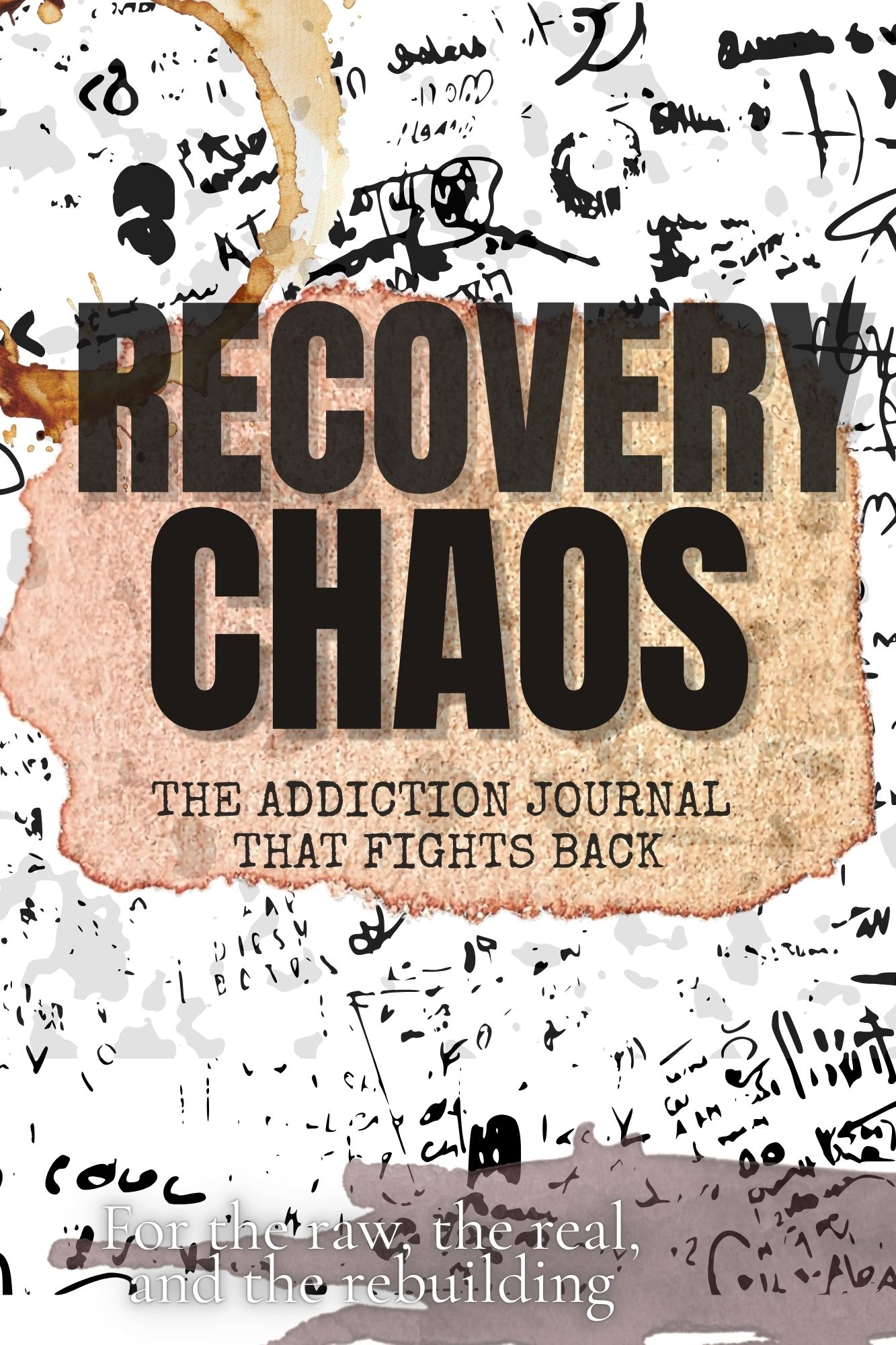
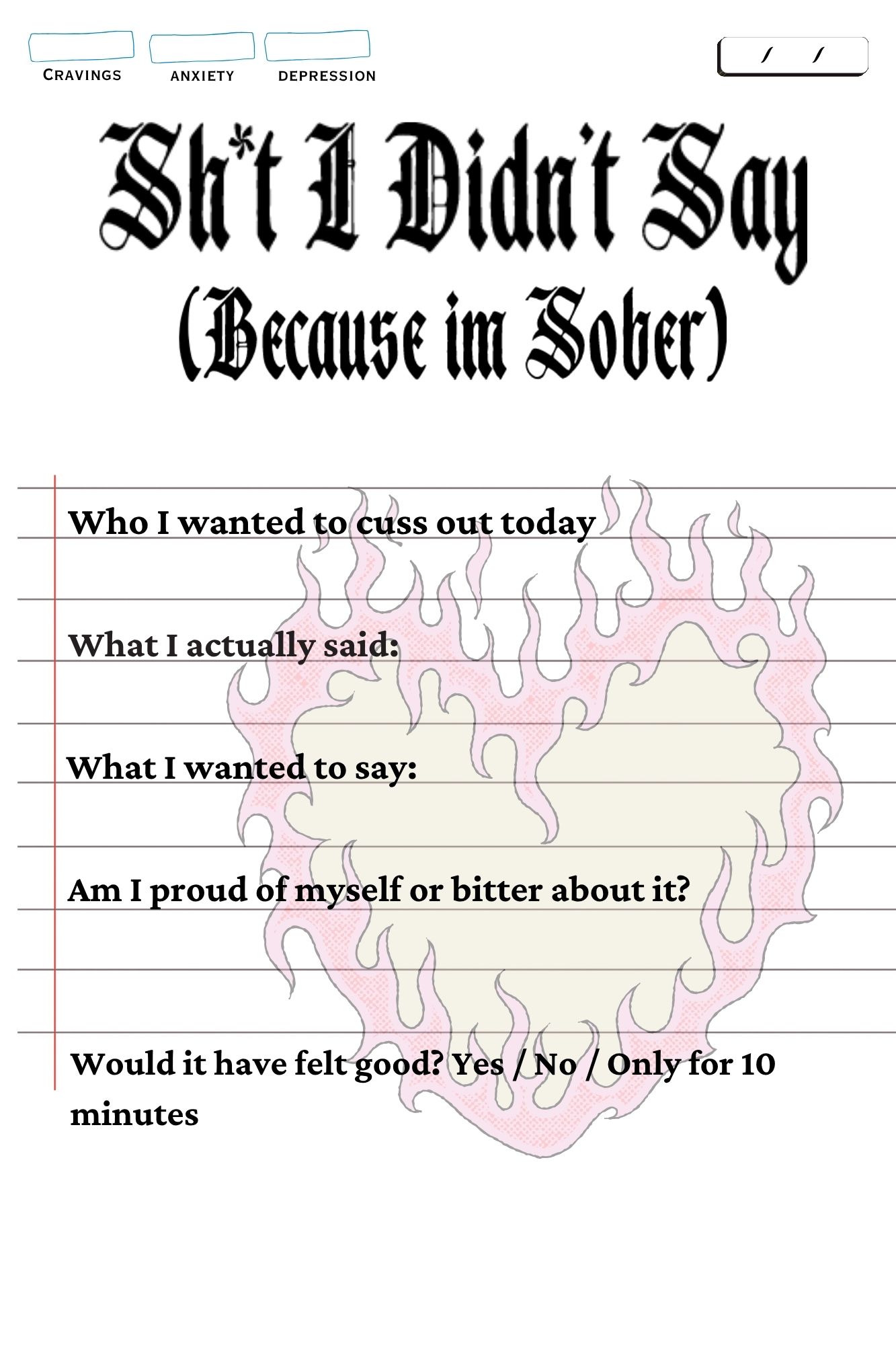
Chaos Recovery
Journal
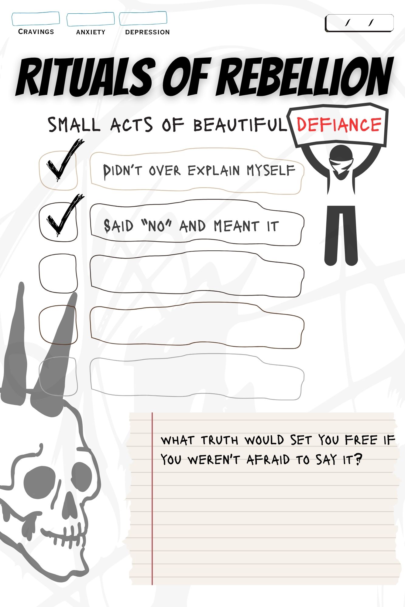
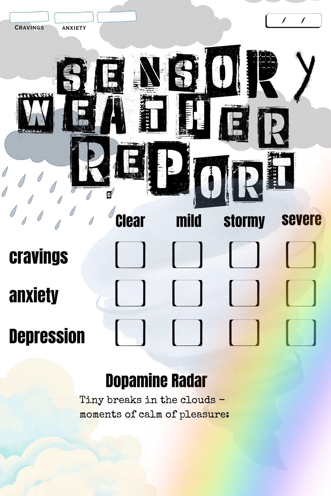
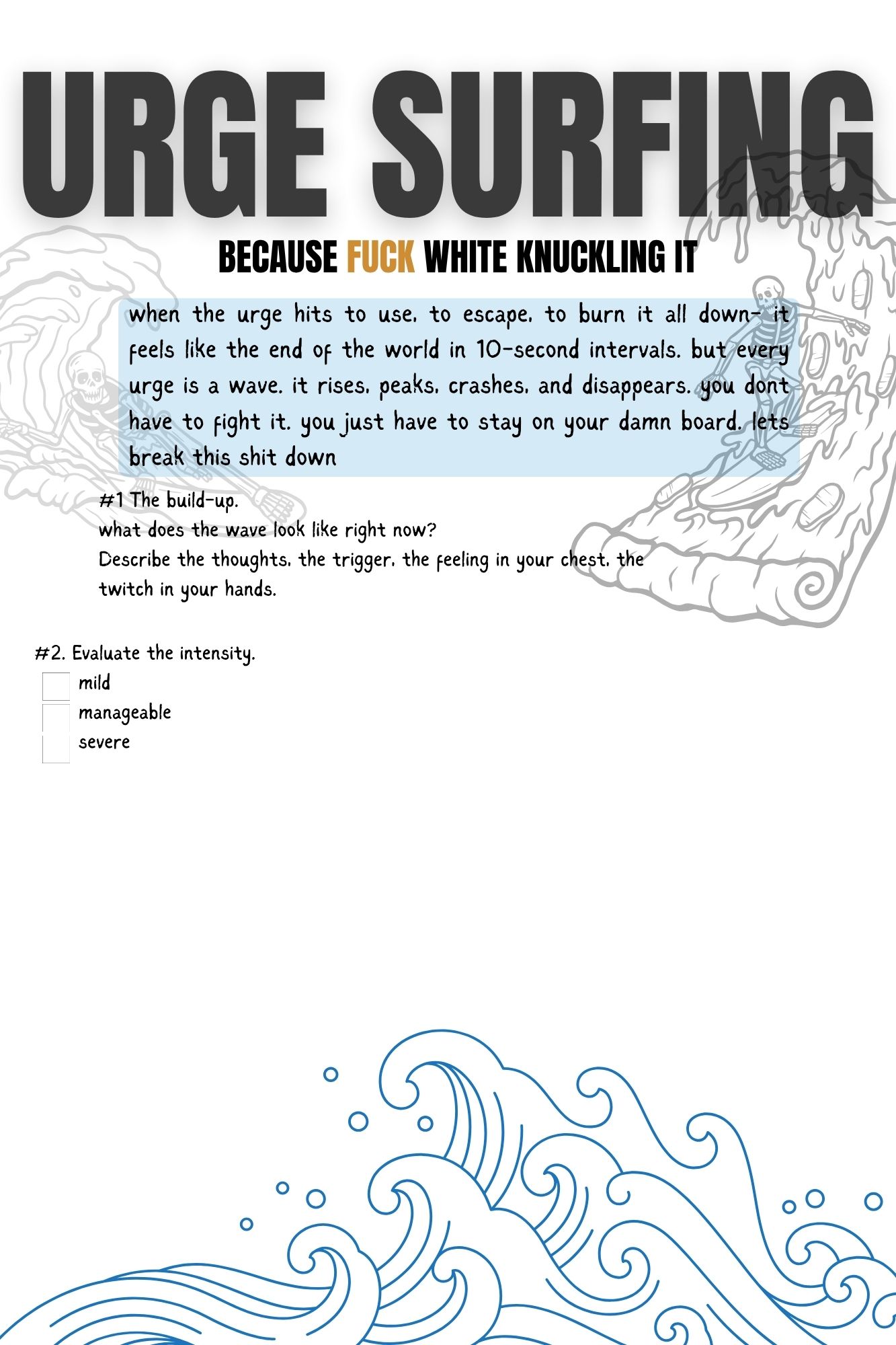
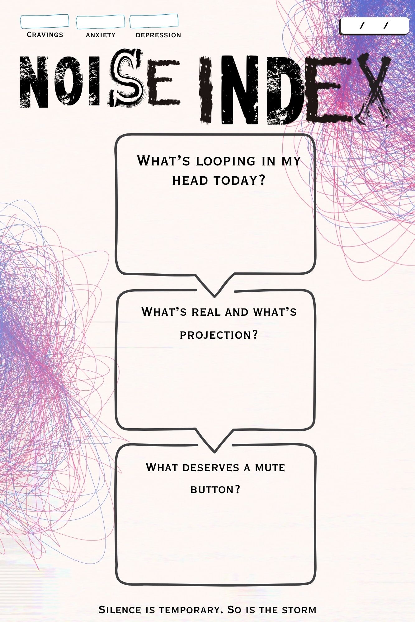
The addiction journal that fights back. Built for people in early sobriety who are tired of pastel affirmations and Pinterest-quote recovery culture.
The recovery journal market is saturated with rigid, shame-inducing formats that feel disconnected from the actual experience of addiction. As a recovering addict, I found myself drowning in a sea of feel-good journals built for people who've already found peace — not for those still in the chaos. The brief was personal: build the journal I needed but couldn't find.
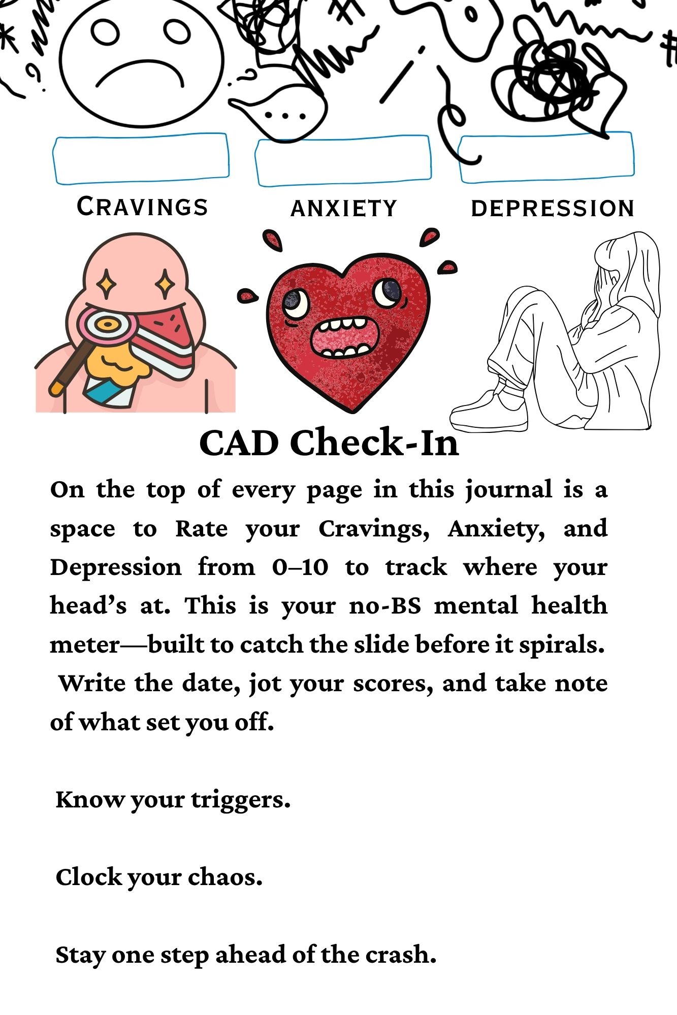
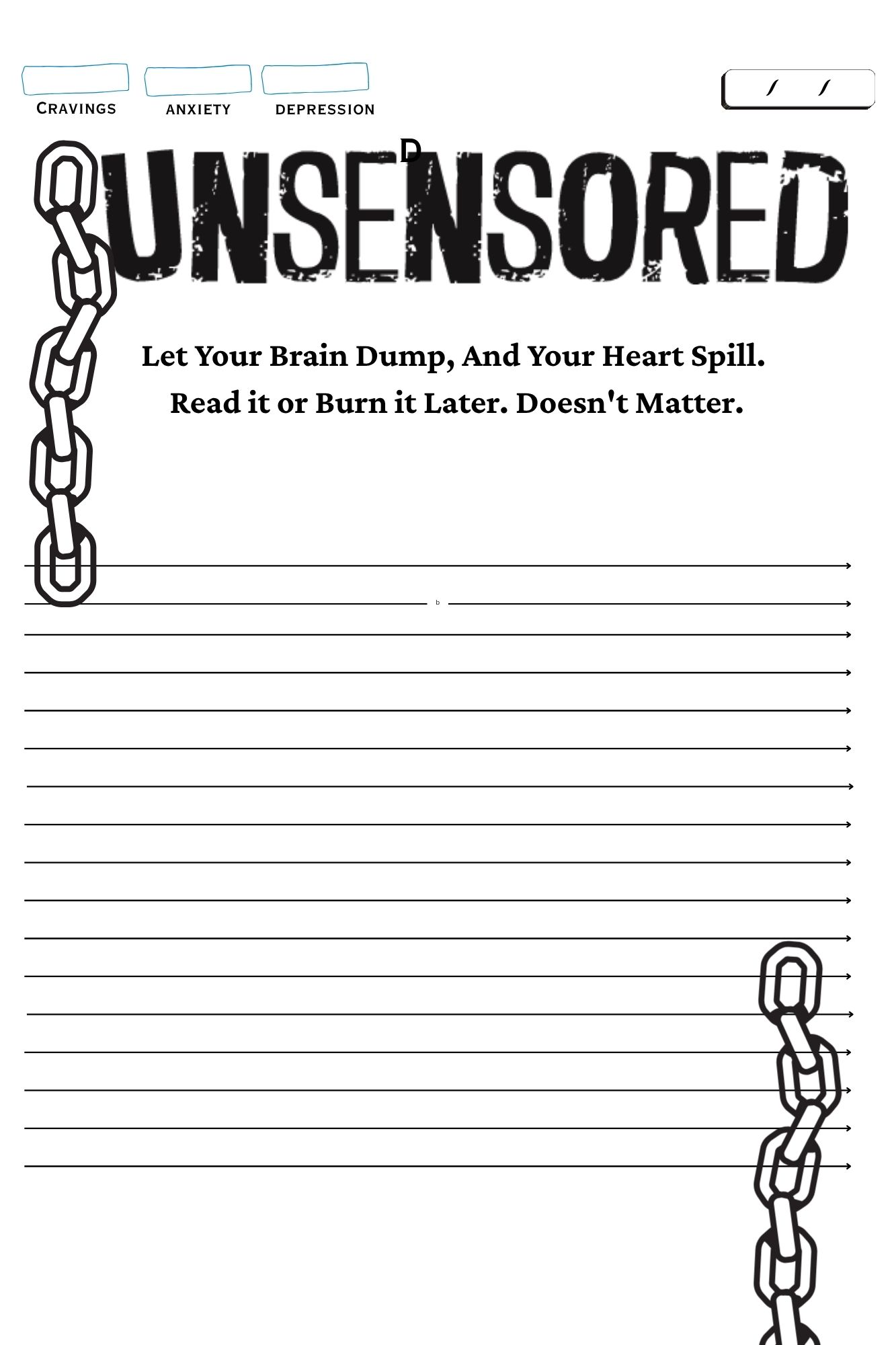
Each page was designed as a standalone printable PDF — reusable, modular, and graphically intense. The CAD (Cravings, Anxiety, Depression) tracking system runs as a persistent header, creating a visual data trail of progress. Background graphics are deliberately muted to preserve readability without sacrificing intensity. Explicit language is used intentionally — as a tool for connection and a small dopamine hit of recognition.
The journal is currently in development, with plans to donate the complete digital PDF to every drug rehabilitation center in the Seattle area. Each page functions as both a therapeutic tool and a brand artifact — demonstrating that design can serve communities that mainstream wellness culture consistently overlooks.
Digital Content System / Print-Ready PDF
Graphic Design, Content Strategy, Brand Voice
People in early addiction recovery
Donation to Seattle-area rehab centers

Radical
Retro
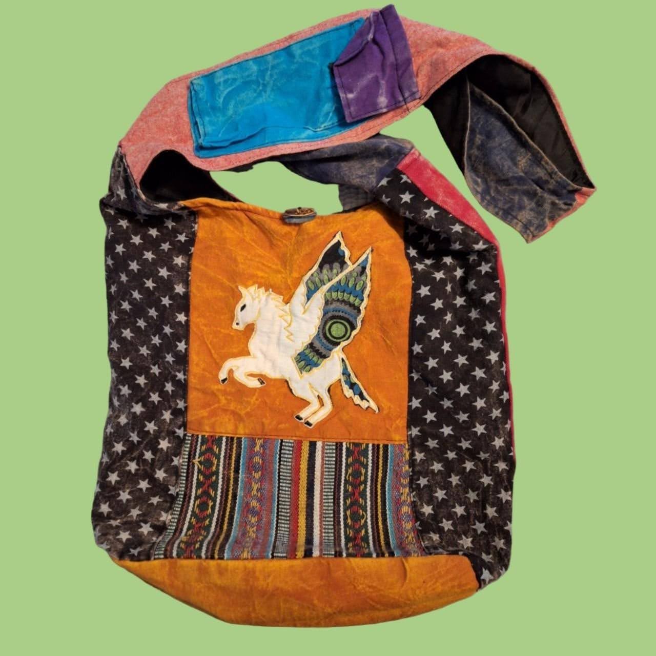
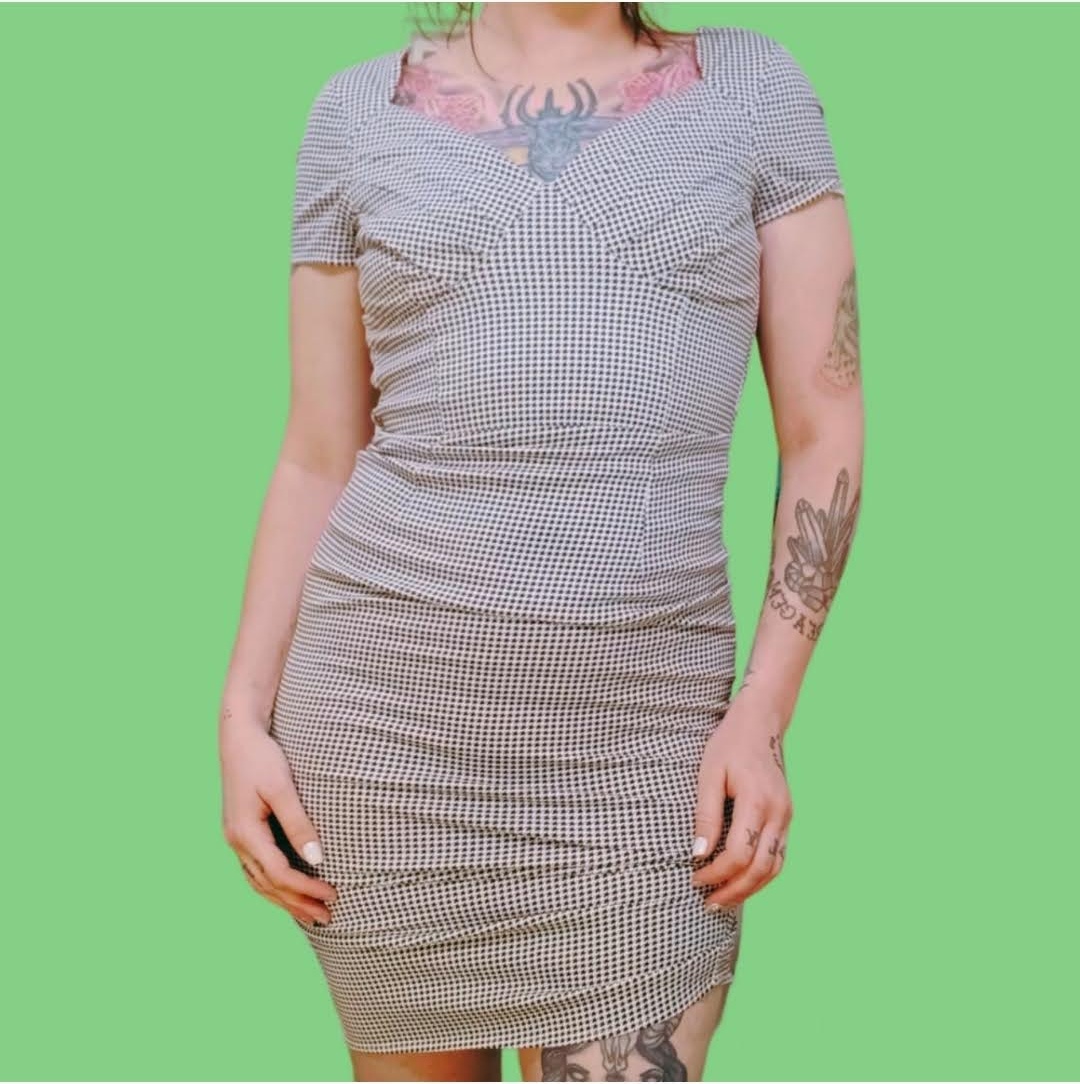
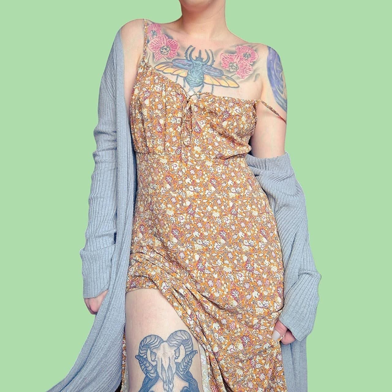
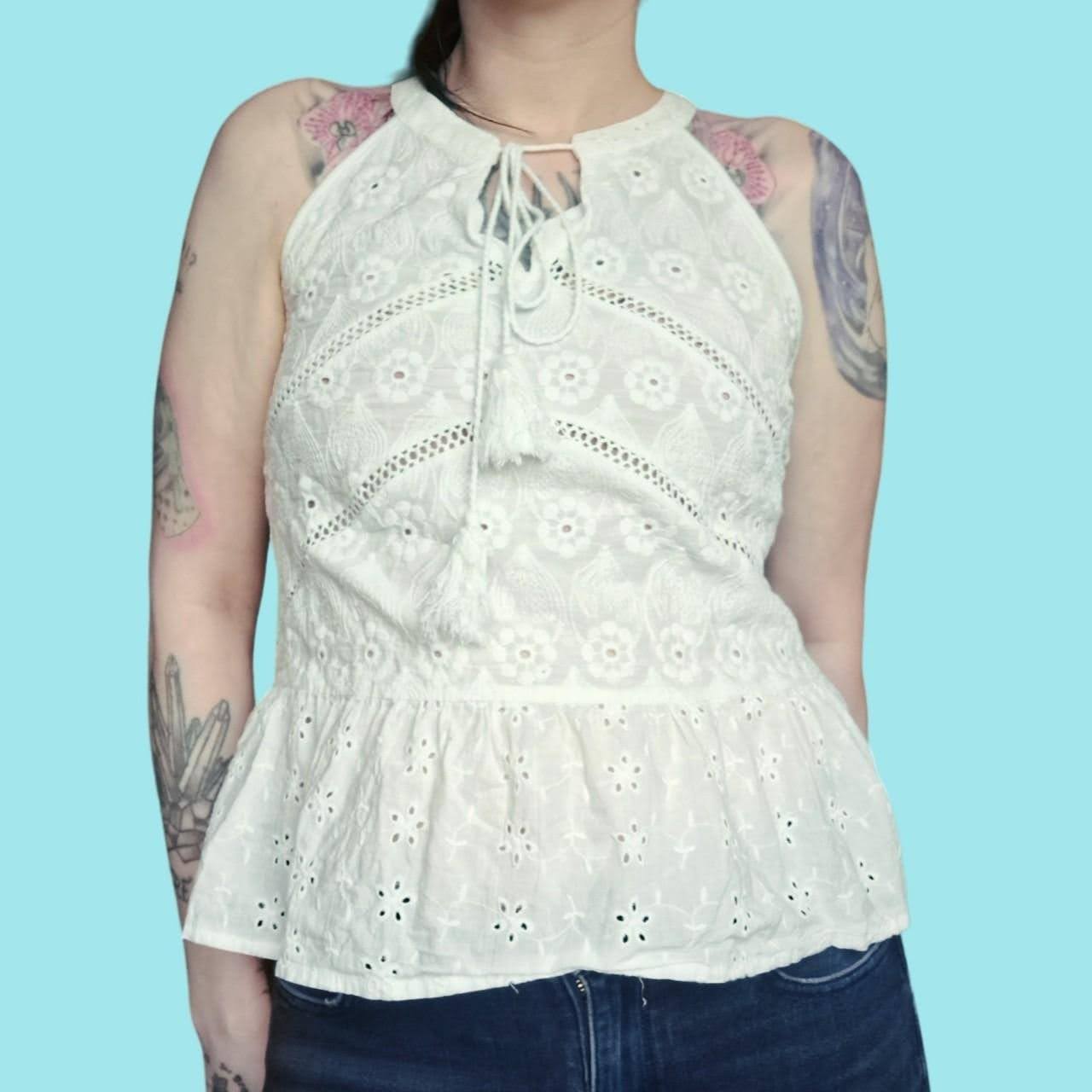
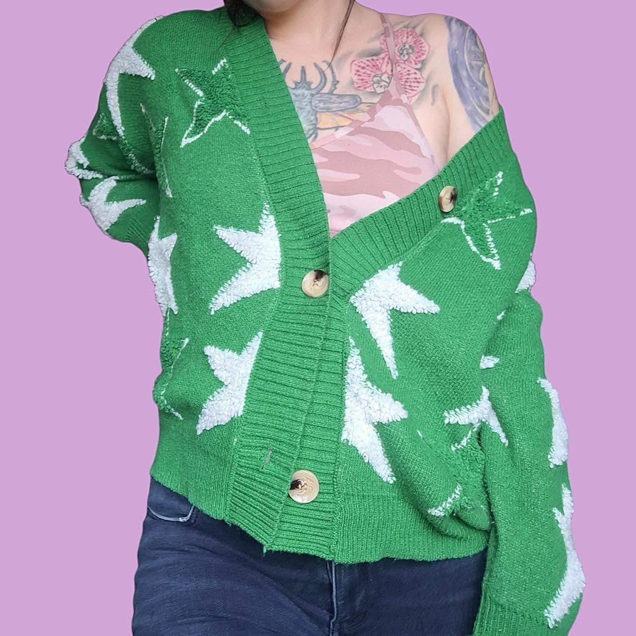
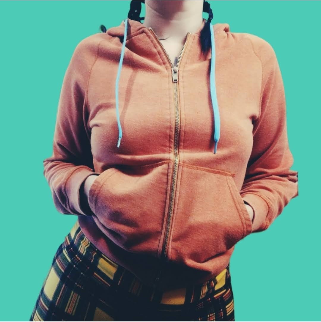
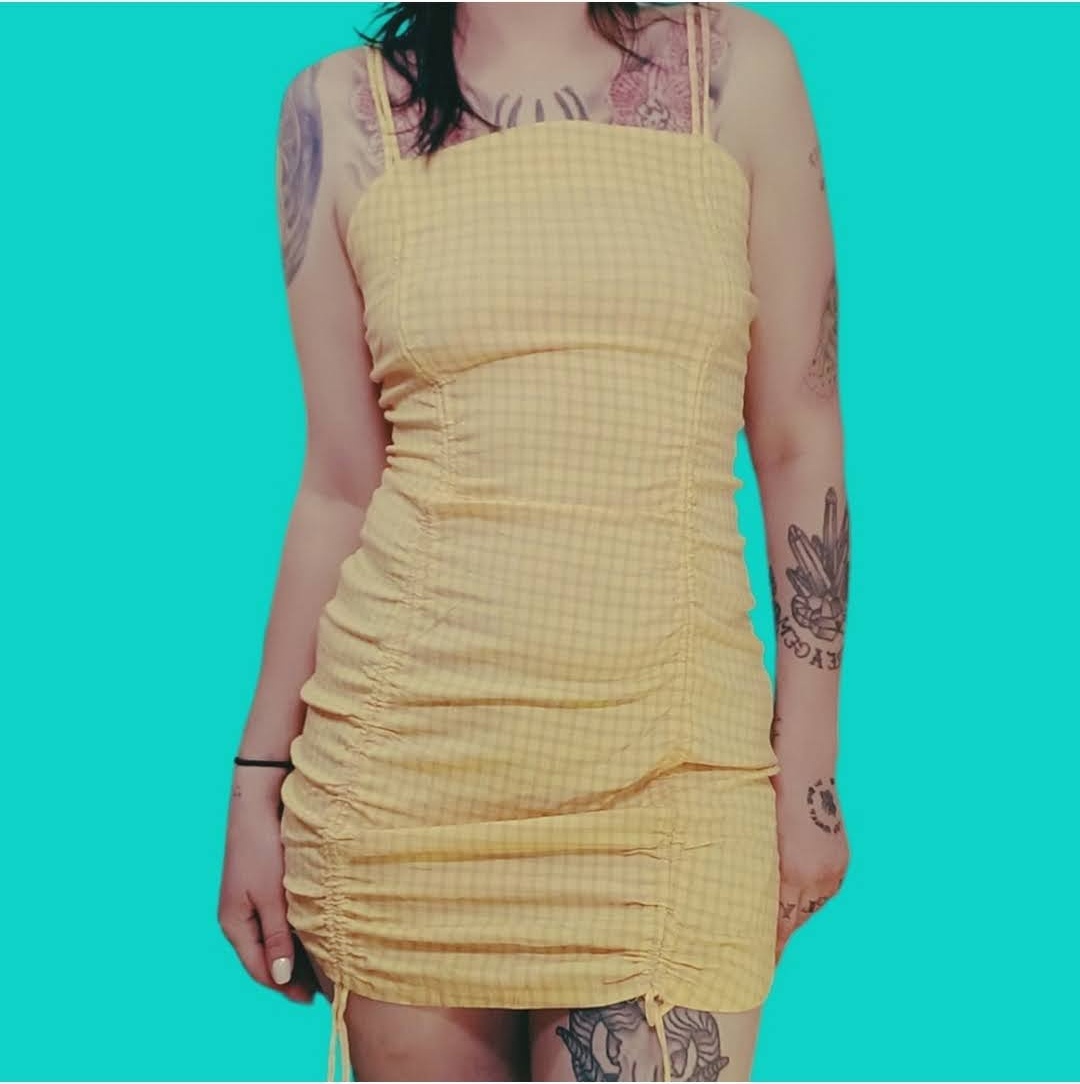
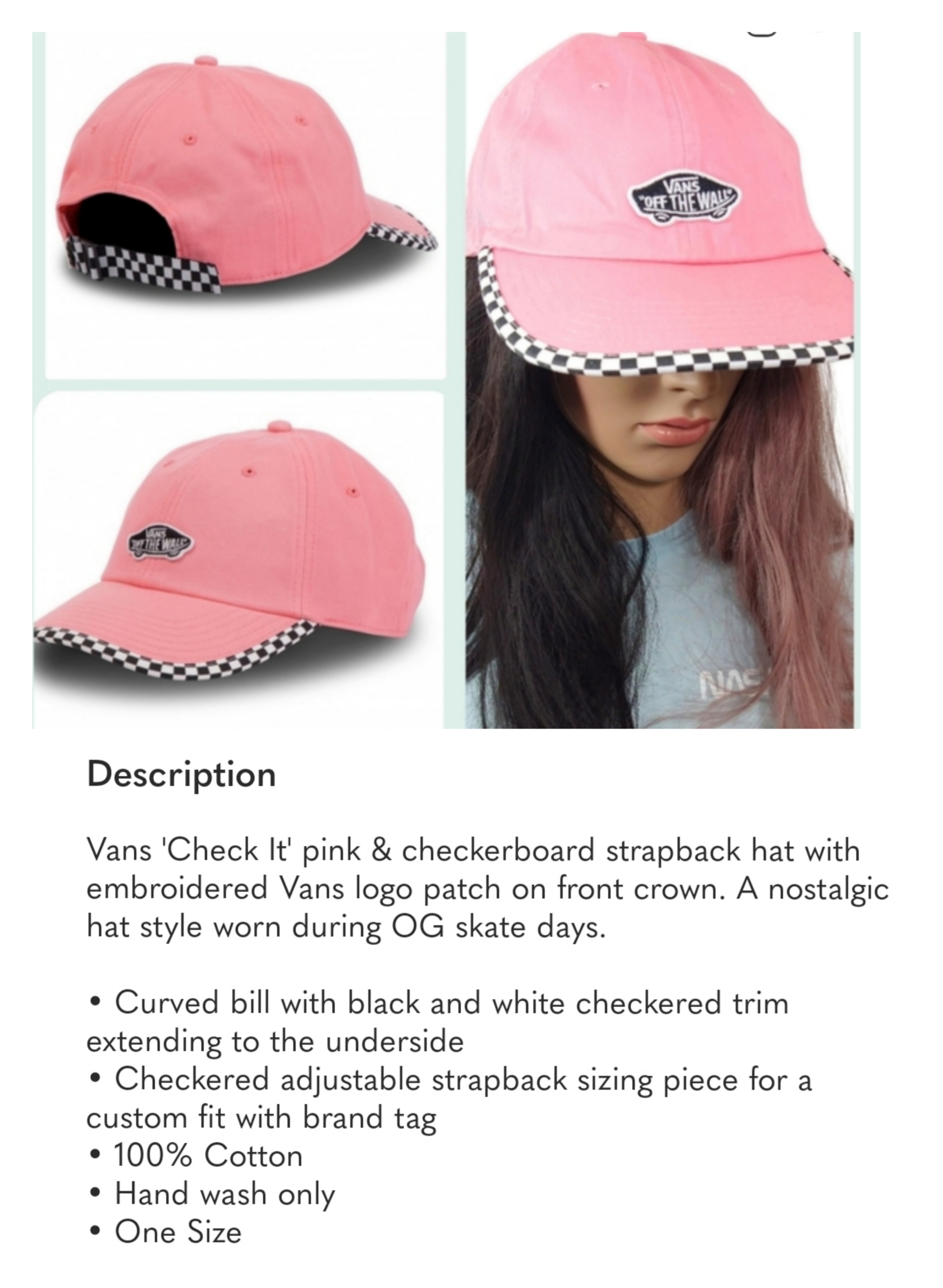
An experimental resale fashion project on Depop. Instead of presenting secondhand clothing as individual products, Radical Retro tested whether styling, narrative photography, and tone of voice could transform resale listings into identity artifacts.
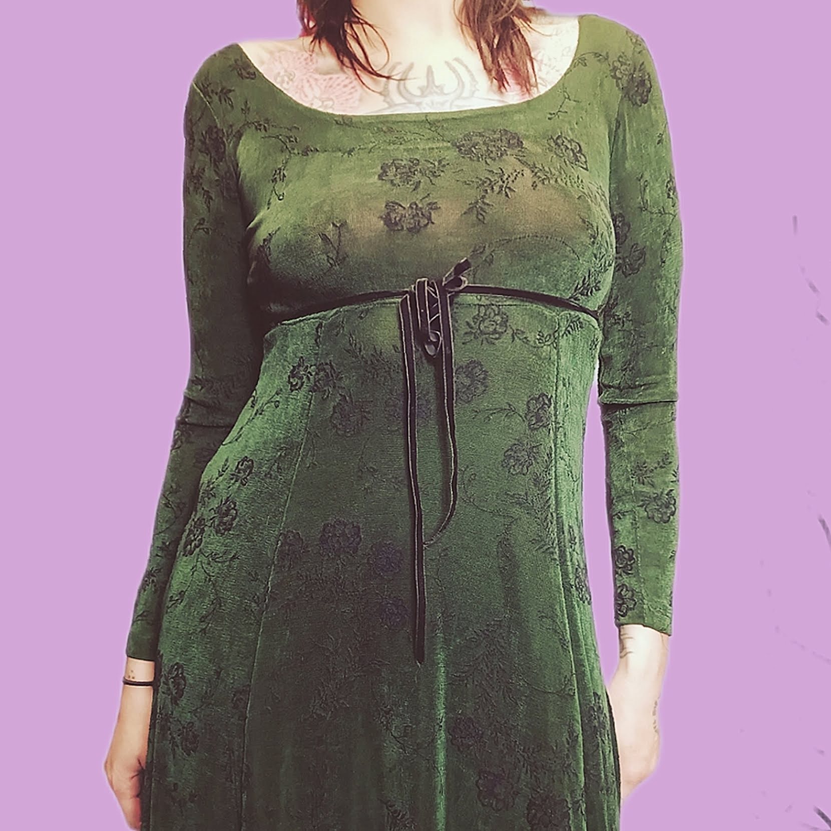
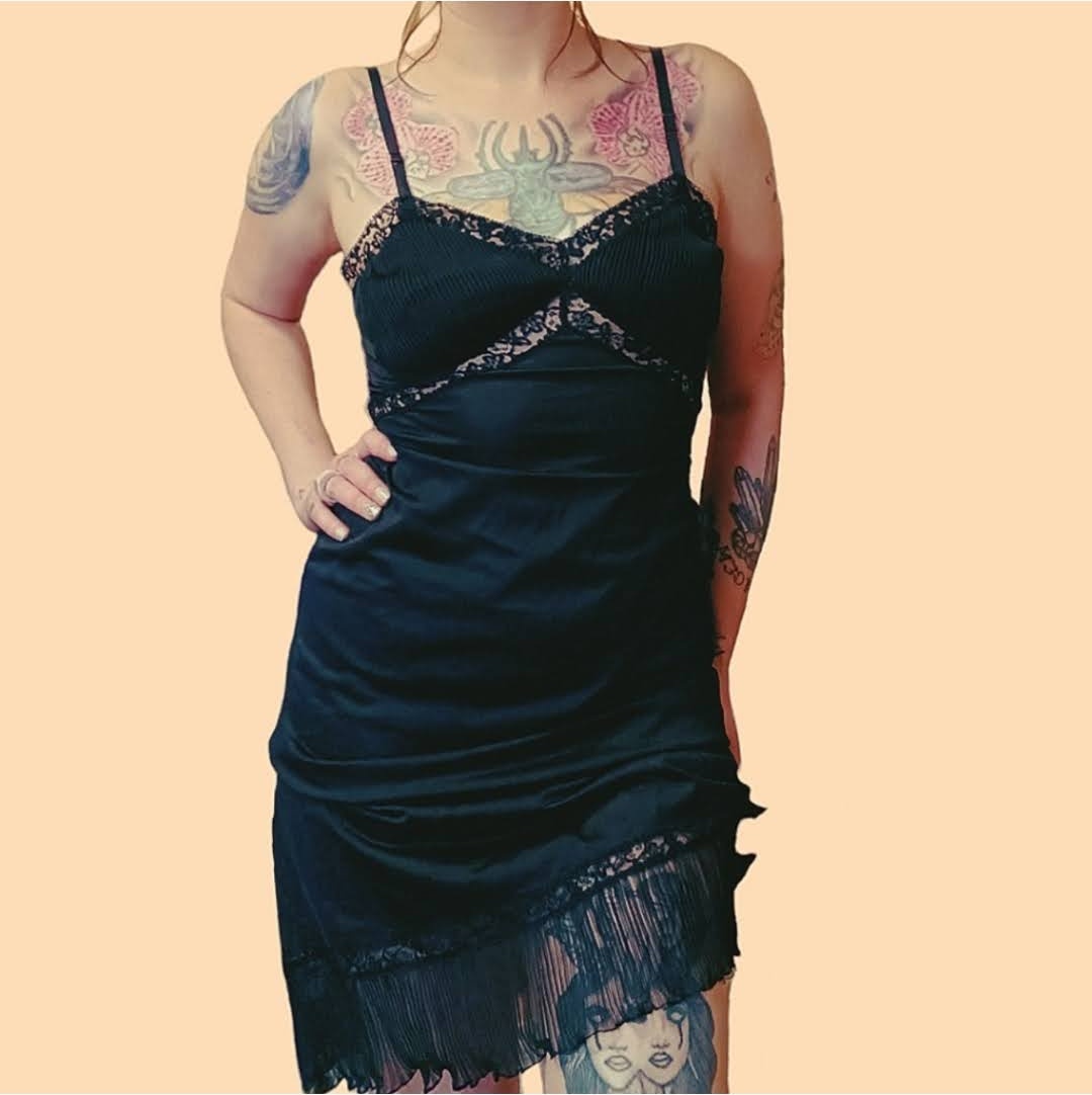
Clothing was modeled and styled to suggest characters or identities rather than simple outfits. Each listing became a fragment of a persona — not a product to be purchased, but an identity to be adopted. The styling transformed ordinary resale items into cultural signals.
Accessories, posture, and environment created visual cues that implied story and identity. Every listing told a micro-narrative. The consistent backdrop, lighting, and post-processing built a unified visual language that made the storefront feel curated rather than random.
The tone rejected traditional marketing language — 'buy it or don't' — to signal authenticity and cultural independence. This voice acted as a filter: it repelled the wrong audience and magnetized the right one. The result proved that perceived value is a design problem, not a sourcing problem.
Depop
Resale Fashion / Cultural Experiment
Narrative Merchandising, Identity Construction, Anti-Sales Voice
Styling and storytelling transform resale clothing into identity artifacts
The workflow is the brand. Radical Retro proves that a repeatable, systemized approach to product presentation is itself a form of brand identity — one that scales without losing consistency.


Everything Sold.
Every single listing. Gone. The consistent visual identity and repeatable photography system didn't just make the storefront look good — it moved product. The wall of yellow SOLD stamps is the only metric that matters.
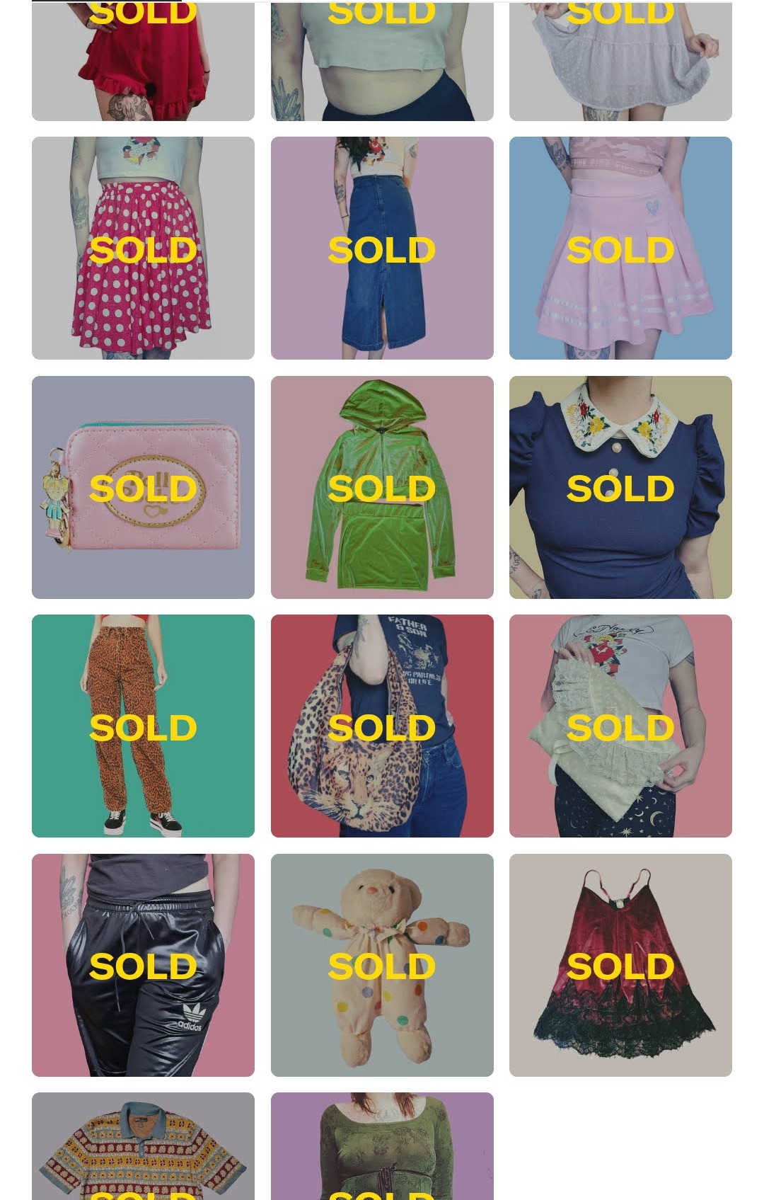
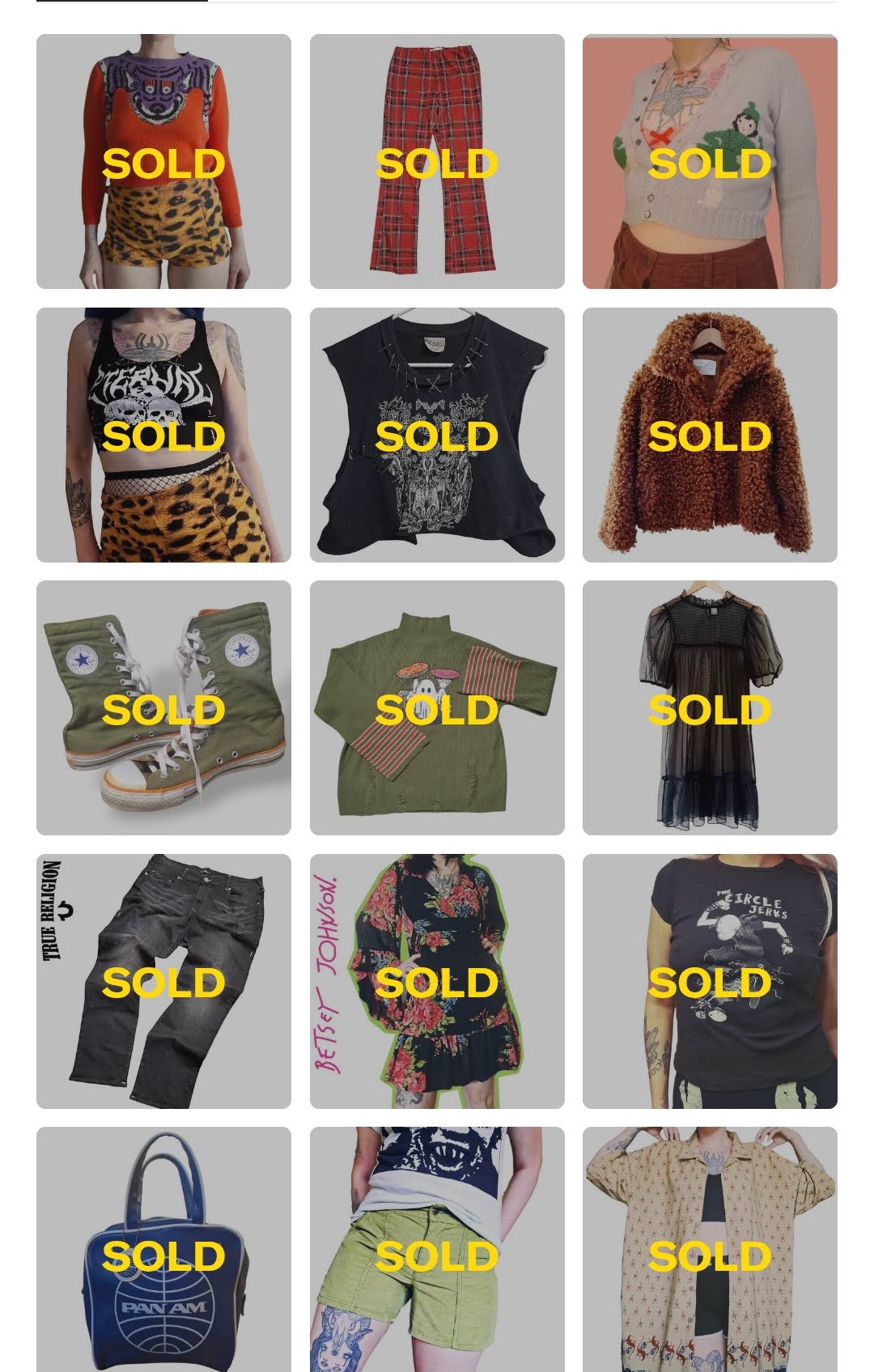
Identity is the product. When every listing shares the same visual language — consistent backdrops, styled on-body shots, and a curated color system — the storefront becomes a brand, not a thrift dump. The SOLD stamps are the receipts.
RagCult
Lounge
Wear
Worship the Wardrobe.
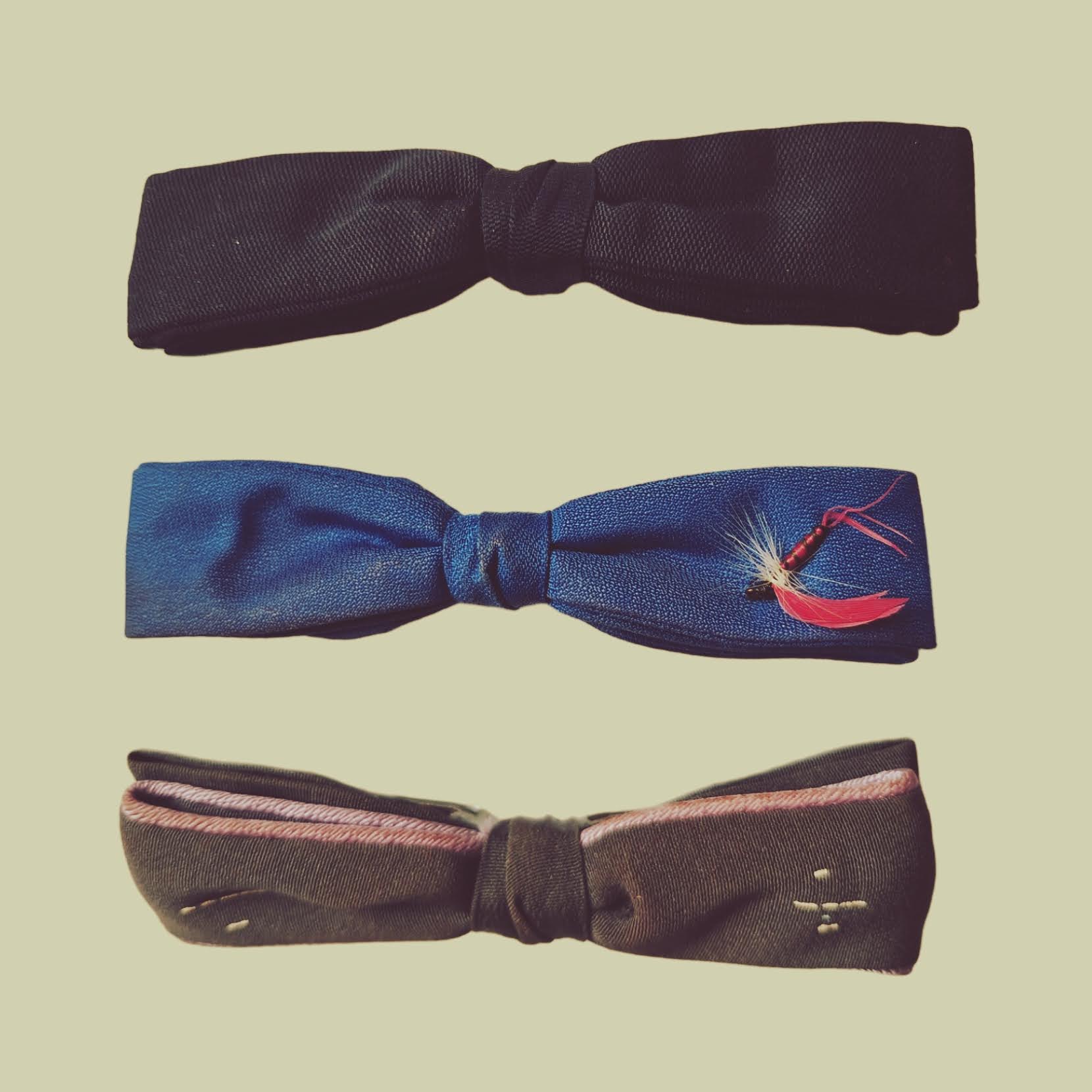
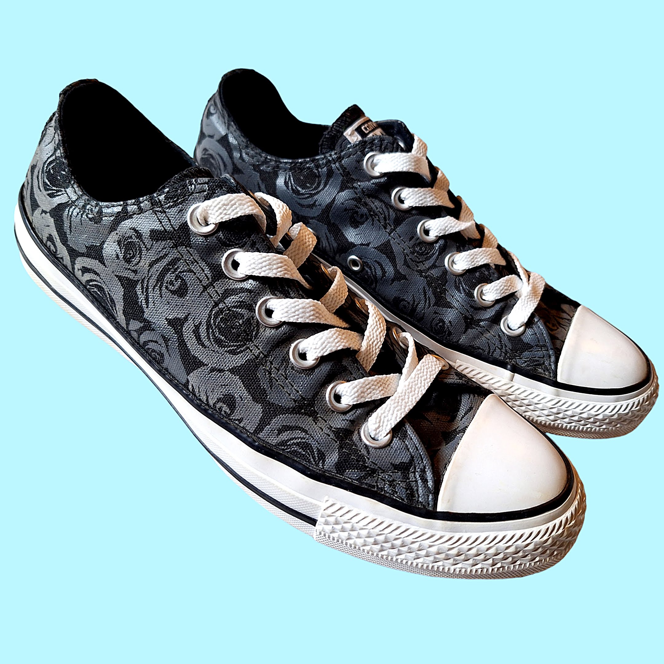
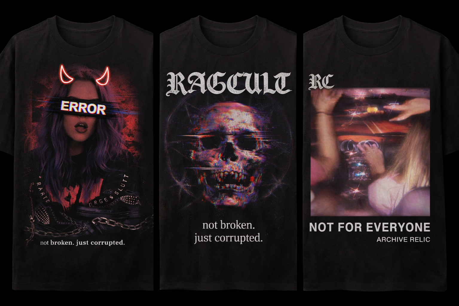
Alt streetwear built on scarcity, social media hype, and an unapologetic brand voice. Limited drops, custom sneaker modifications, and a community that doesn't need your approval.
Scarcity
Once it's gone, it's gone forever.
Every piece is a limited run. No restocks, no second chances. The scarcity model isn't artificial — it's the philosophy. Each drop is a moment in time. You were either there or you weren't.
Hype Architecture
Social media as a weapon.
Every merch drop is preceded by a deliberate social media campaign designed to build anticipation, create urgency, and reward the community that pays attention. The hype isn't the byproduct — it's the product.
Unapologetic Branding
Buy it or don't.
RagCult Lounge doesn't chase customers. The brand voice is direct, confrontational, and completely uninterested in mass appeal. The attitude is the filter — it repels the wrong audience and magnetizes the right one.
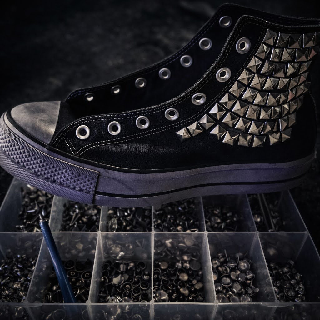
Custom Orders
Ship us your sneakers.
Send your kicks and we'll stud, spike, and transform them into one-of-a-kind pieces. Pricing is determined by the complexity of the request. Every pair is a collaboration between the brand and the customer.
Ship Us Your Sneakers.
We'll stud and spike the shit out of them. Every pair is a one-of-one collaboration. Pricing is determined by the complexity of your request — the crazier the vision, the higher the cost. No templates. No limits.
Alt Streetwear / Custom Footwear
Limited Drops + Custom Orders
Brand Identity, Social Media Strategy, Product Design
Scarcity as identity. The drop is the event.
Wear the
Archive
"Nothing new. Everything legendary."
Secondhand clothing is not used clothing. It is cultural artifacts waiting for reinterpretation. This campaign reframes resale fashion as recovered cultural material rather than discarded goods.
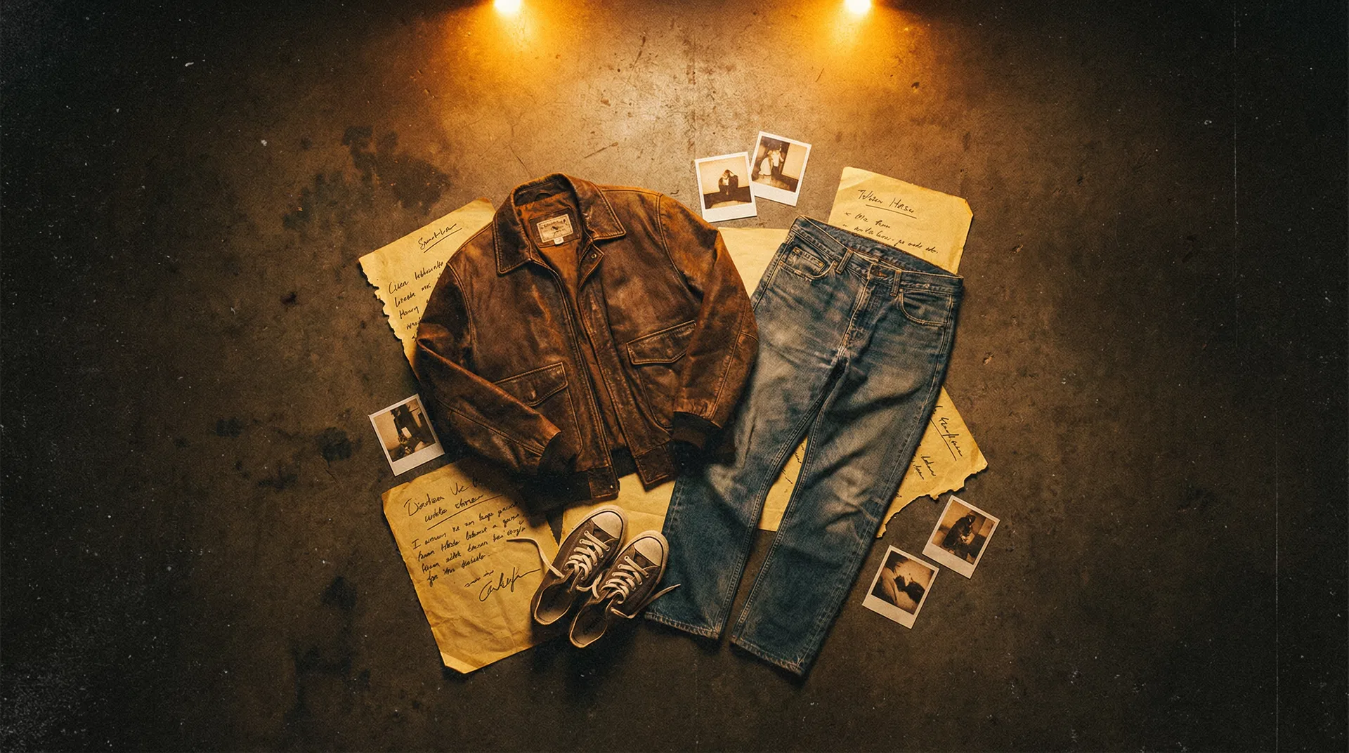
Archive-Style Product Storytelling
Each garment is presented as a recovered artifact — catalogued, documented, and contextualized within a broader cultural narrative rather than listed as inventory.
Persona-Based Lookbooks
Styling creates characters, not outfits. Each lookbook entry suggests a complete identity that the viewer can adopt, making the clothing a vehicle for self-construction.
Narrative Captions
Product descriptions function as micro-stories. They establish provenance, imply history, and embed the item within an aesthetic world that extends beyond the transaction.
Underground Editorial Visual Identity
Photography references independent fashion zines and underground editorial — raw lighting, analog grain, and compositions that reject the polished e-commerce standard.
Reframe resale fashion as cultural artifacts rather than secondhand goods. Demonstrate that the value of clothing is determined by the narrative it carries, not the price it originally sold for.
Uncurated
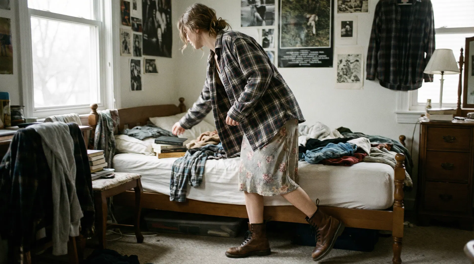
"Nothing styled. Just worn."
Social media aesthetics create pressure to curate identity. This campaign explores the appeal of rejecting aesthetic performance — documenting what people actually wear before the camera turns on.
Unstyled Photography
No art direction. No mood boards. Clothing is captured as it exists in the moment — wrinkled, layered wrong, half-tucked. The camera documents rather than directs.
Imperfect Environments
Messy bedrooms, cluttered floors, bathroom mirrors. The setting rejects the curated backdrop and embraces the spaces where people actually get dressed.
Accidental Outfit Combinations
Pairings that happen by chance rather than intention. The campaign celebrates the outfits people wear when nobody is watching — before the aesthetic filter gets applied.
Documentary-Style Visuals
Shot on film. Motion blur. Unflattering angles. The visual language borrows from photojournalism rather than fashion editorial, treating clothing as evidence rather than aspiration.
Aesthetic communities gave people permission to post themselves publicly. But that permission came with rules — the right filter, the right angle, the right backdrop. Uncurated asks: what happens when you remove the rules but keep the clothing?
Explore authenticity and resistance to aesthetic performance. Test whether anti-curation can function as its own aesthetic — and whether audiences respond to honesty the same way they respond to polish.
Closet Audit
the workflow is the product.
Most resellers treat listing like an afterthought — phone photos in bad lighting, inconsistent descriptions, erratic posting schedules. The result: closets that look like digital garage sales. Buyers scroll past. Algorithms bury you. Items sit for months.
Streamline everything. Standardize photography, templatize descriptions, prep items the night before, and post strategically at peak times. The closet becomes a brand. The workflow becomes repeatable. The results become predictable.
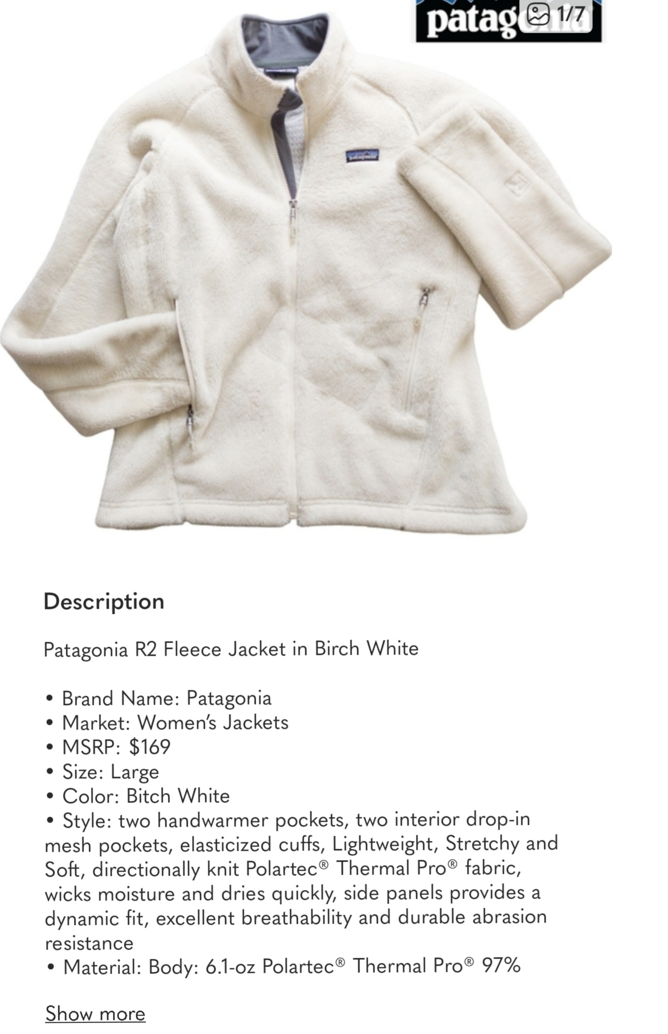
Brand | Style Elements | SizeExample: Patagonia | R2 Fleece Jacket Birch White | L
Lint removal, steaming, loose strings cut, stain/rip/snag check
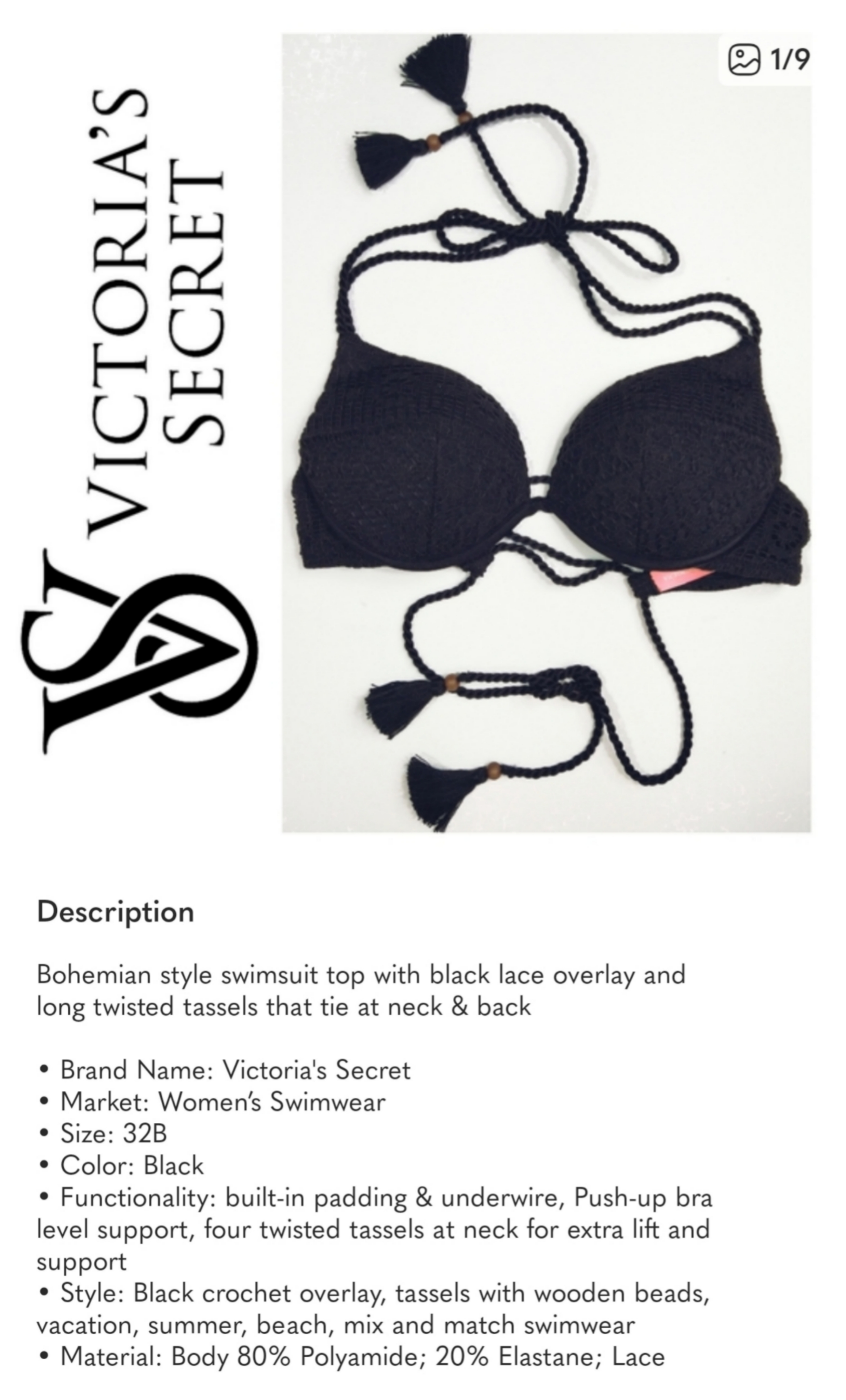
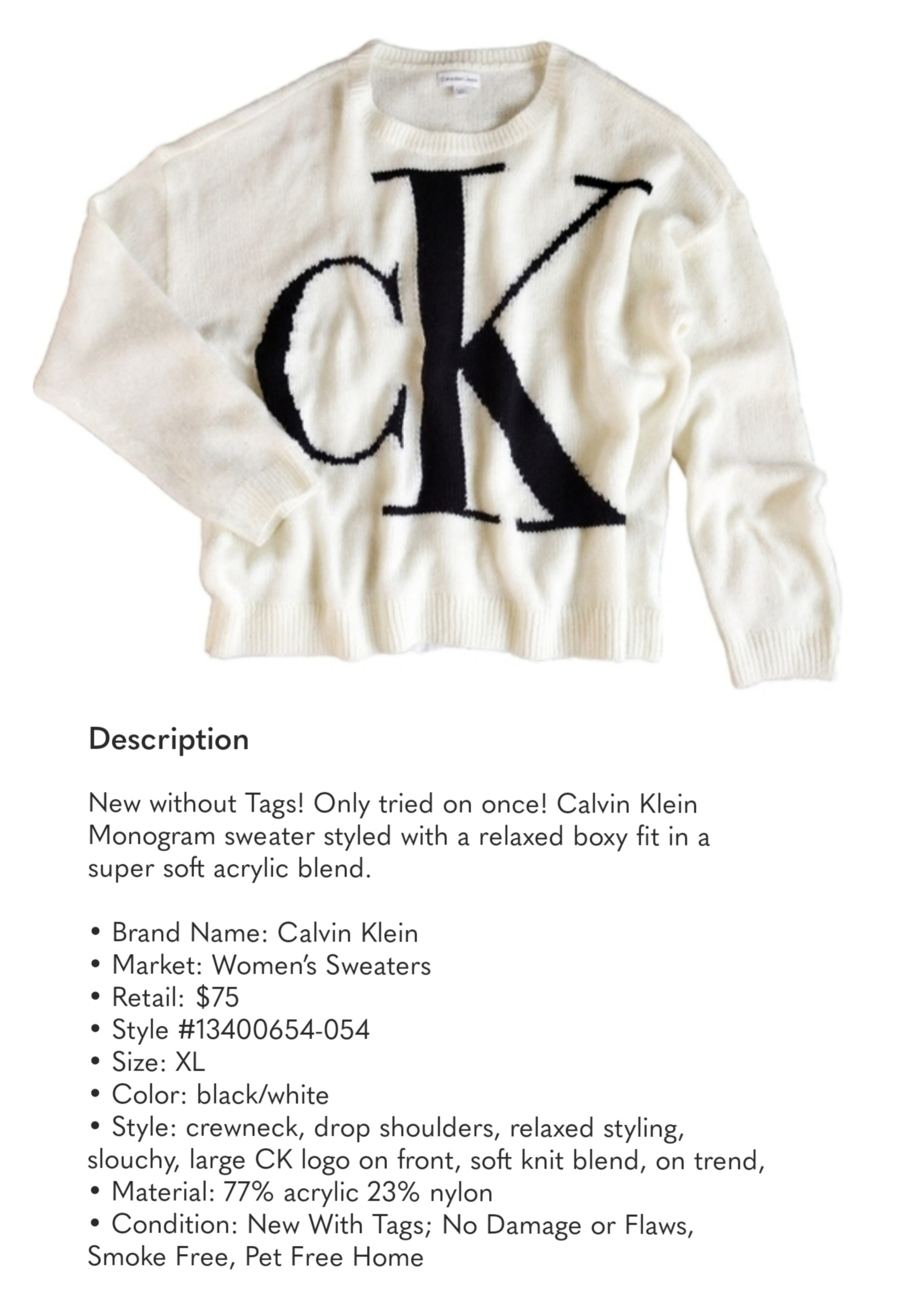
Batch shoot prepared items — flat lay, white bg, brand visible
Title formula + description template — copy, paste, customize
List at peak times instead of erratic dumps that tank visibility
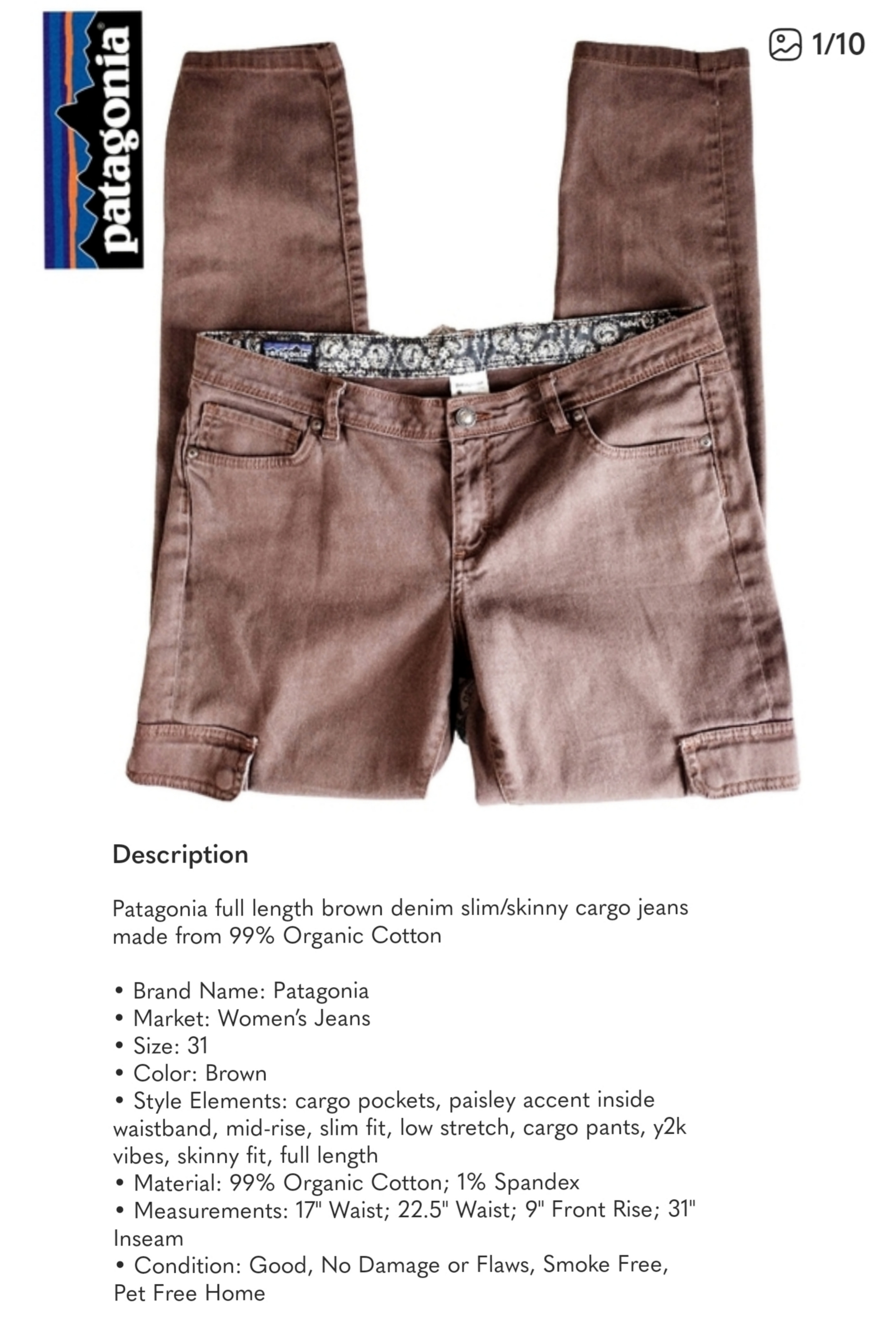
Streamlined. Strategic. Sold.
The system eliminates decision fatigue. Every item gets the same treatment. The result isn't just faster listings — it's a closet that looks like a brand, performs like a store, and frees up time for the work that actually grows the business.
This isn't about Poshmark. It's about proving that a systemized approach to product presentation — standardized photography, templatized copy, and strategic timing — transforms any resale operation from a side hustle into a scalable brand. The methodology is platform-agnostic. The results are universal.
Let's
Talk
Currently open to brand identity projects, content system work, and collaborations with niche communities building something that matters. If you're building for the ones who don't fit the mold — reach out.
© 2025 RagCult Studio · Seattle, WA
If you know, you know.